Chocolate Martin, a luxurious formula for 2025 wall art
Chocolate Martin, a luxurious formula for 2025 wall art
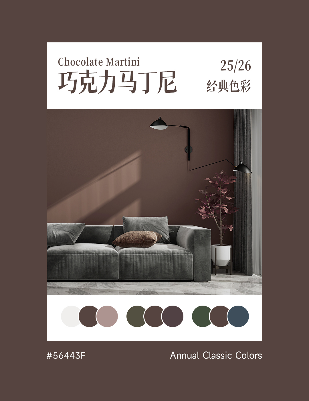
Deep brown tone
Let the home be filled with warmth
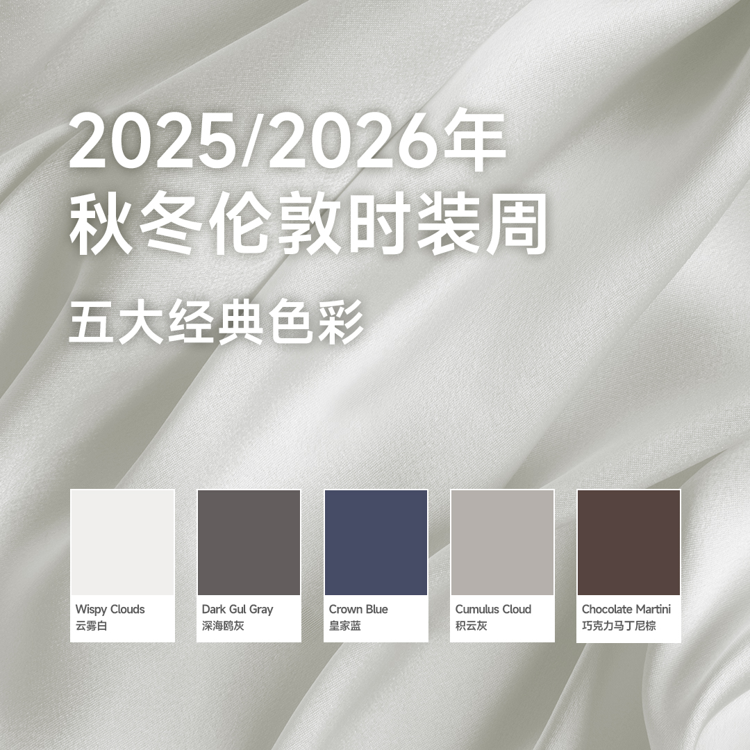
Classic colors for autumn and winter of 2025/2026
In the map of the color world, a rich and profound brown tone is quietly occupying the forefront of design - it has been given a thought-provoking name: Chocolate Martini. This color scheme, originating from the earth and inspired by cocoa, has the warm and mellow taste of caramel, becoming one of the most eye-catching classic colors of 2025.
This color is not an ordinary brown, its charm lies in its unique duality: it retains the simplicity and stability of natural soil, while enhancing a sense of sophistication through subtle gray levels. It is silky smooth like melting dark chocolate and serene like aged oak, creating a 'low-key luxury' atmosphere in the indoor space.
In contemporary home design, this type of earthy color scheme is sparking a wave of return. People long to establish a deeper connection with nature and pursue a living space that combines comfort and refinement. The warm, inclusive, and layered tones precisely respond to this emotional need.
Color gene decoding
A cup called Classic Rich
Classic colors for autumn and winter of 2025/2026
The color composition of Chocolate Martini is extremely intelligent - it is based on dark brown and incorporates subtle shades of gray purple, reducing the warmth of traditional brown and adding a modern and calm restraint. This balance makes it neither overly enthusiastic nor indifferent, just like a carefully crafted cocktail with distinct layers and a long-lasting aftertaste.
At the level of color psychology, this color tone has a dual effect: it can bring a sense of stability and protection unique to the earth color system, while maintaining a refreshing and non oppressive characteristic due to its moderate grayscale. Research has shown that such warm neutral colors can effectively reduce the anxiety index of space users and improve psychological comfort.
Compared to traditional brown varieties, the unique advantage of Chocolate Martini lies in its extraordinary adaptability. Presenting completely different expressions on different materials: silky smooth like velvet on matte walls; Show delicate textures on wooden furniture; When paired with metal elements, it instantly enhances the light luxury temperament. This versatile feature makes it a secret weapon for designers.
Wall art interpretation
Multiple Sonata in Space
Classic colors for autumn and winter of 2025/2026
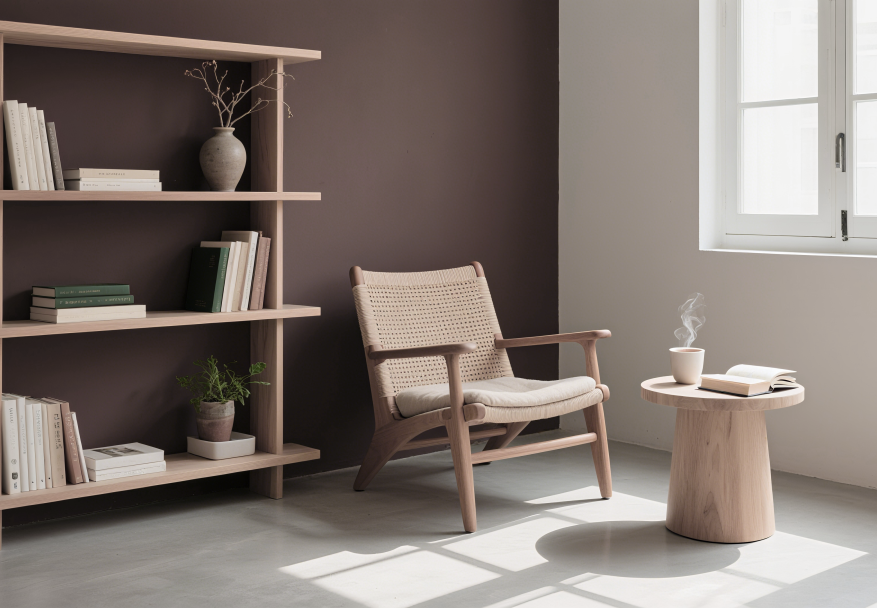
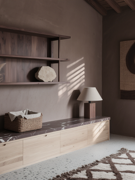
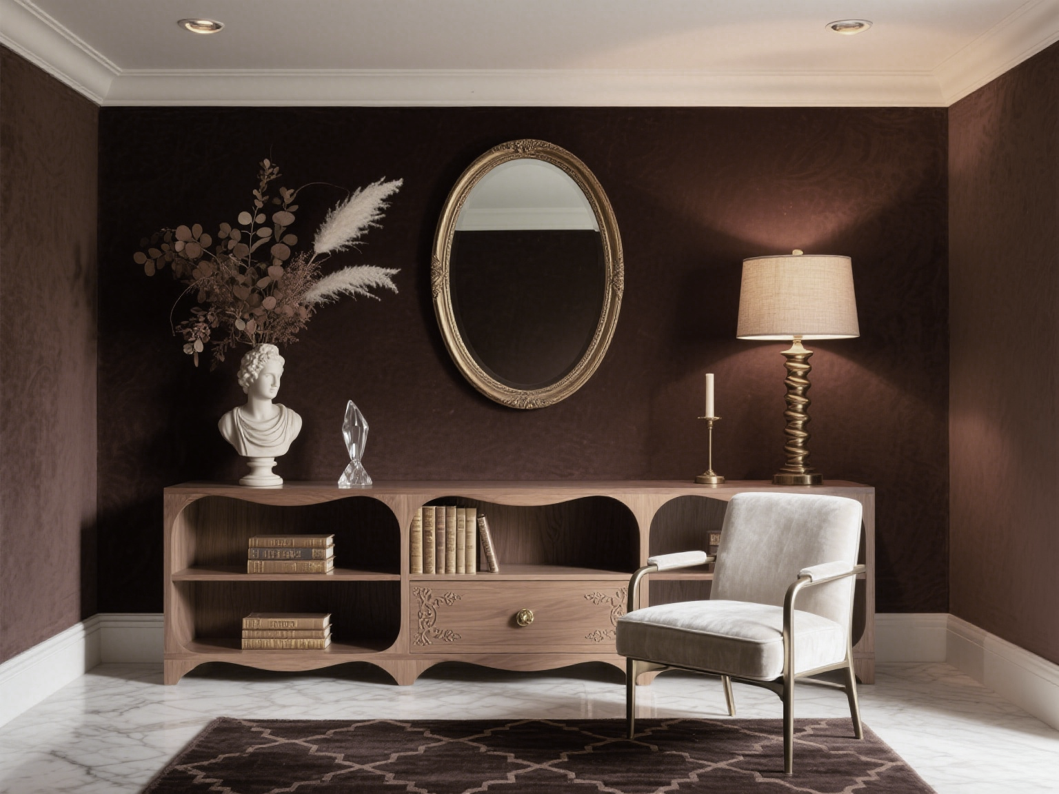
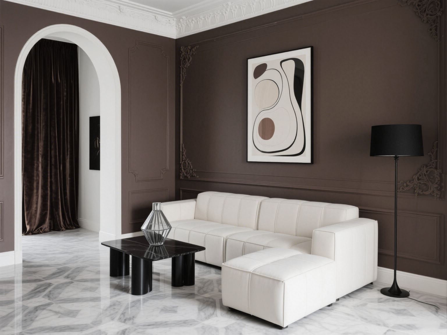
When used as the main color on the wall, Chocolate Martini exhibits amazing plasticity. In a well lit living room, extensive use can create an elegant and stable tone, especially suitable for pairing with modern minimalist furniture. It is worth noting that this deep color tone is also suitable for small spaces - when used in a study or bedroom, it can create a enveloping "cave effect" that brings a sense of psychological security.
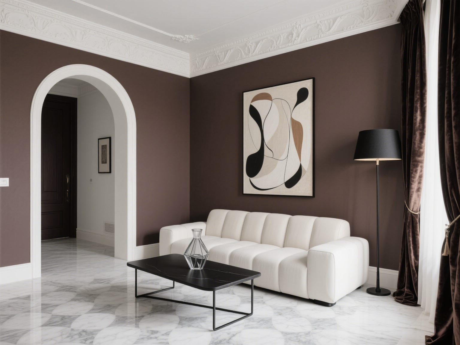
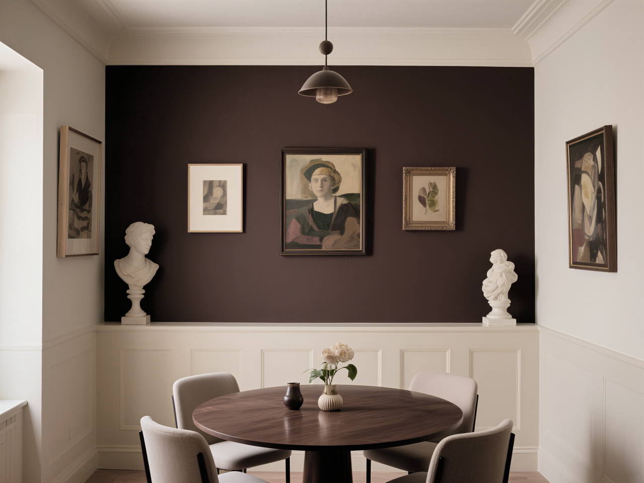
The creative application method is to create a focal wall in an open space. Use Chocolate Martini on one wall of the restaurant, while keeping the rest of the walls in a light neutral color to avoid oppression and create visual focus. This processing technique is particularly suitable for showcasing art collections, making paintings and sculptures stand out in front of dark backgrounds.
Another advanced gameplay is material mixing. Combining Chocolate Martini coating with natural wood, stone, or wicker elements, different textures converse in the same color scheme, creating rich and harmonious spatial layers. A chocolate colored art wall with a special texture technique, paired with a light colored wooden bookshelf, can achieve a magazine level design effect.
Harmonious Color Matching Rule
Creating a premium visual feast
Classic colors for autumn and winter of 2025/2026
01. Micro Contrast Elegant Series
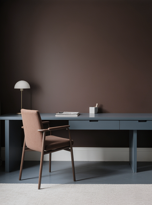
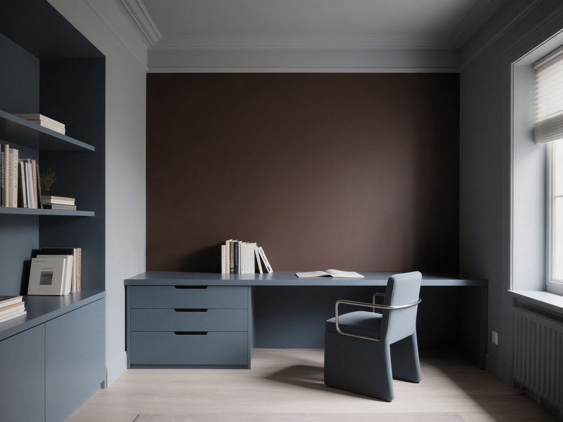
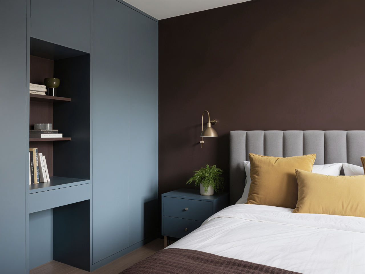
When Chocolate Martini meets the gray blue color scheme, a wonderful chemical reaction occurs. This contrast between warmth and coldness is neither overly strong nor vivid enough, especially suitable for creating exquisite bedroom or study spaces.
Suggest using a ratio of 70% main color+25% gray blue+5% bright color accents, such as pairing with mustard yellow cushions or green plants, to add vitality.
02. Same color gradient
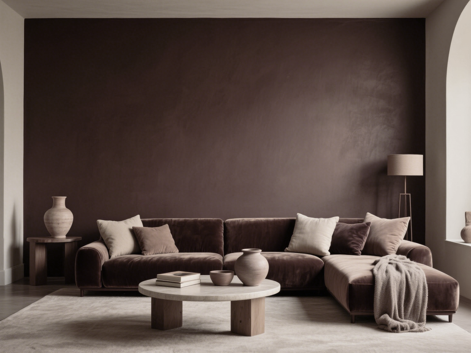
The safest advanced solution is to dance with nearby earth colors. Create rich layers in a unified color palette, ranging from light beige, oat to dark coffee. This monochrome scheme is particularly suitable for small spaces, with a stronger visual extension. The key is to match different textures - try pairing velvet sofas with matte walls, and then embellishing them with frosted pottery.

03. Sweet finishing touch
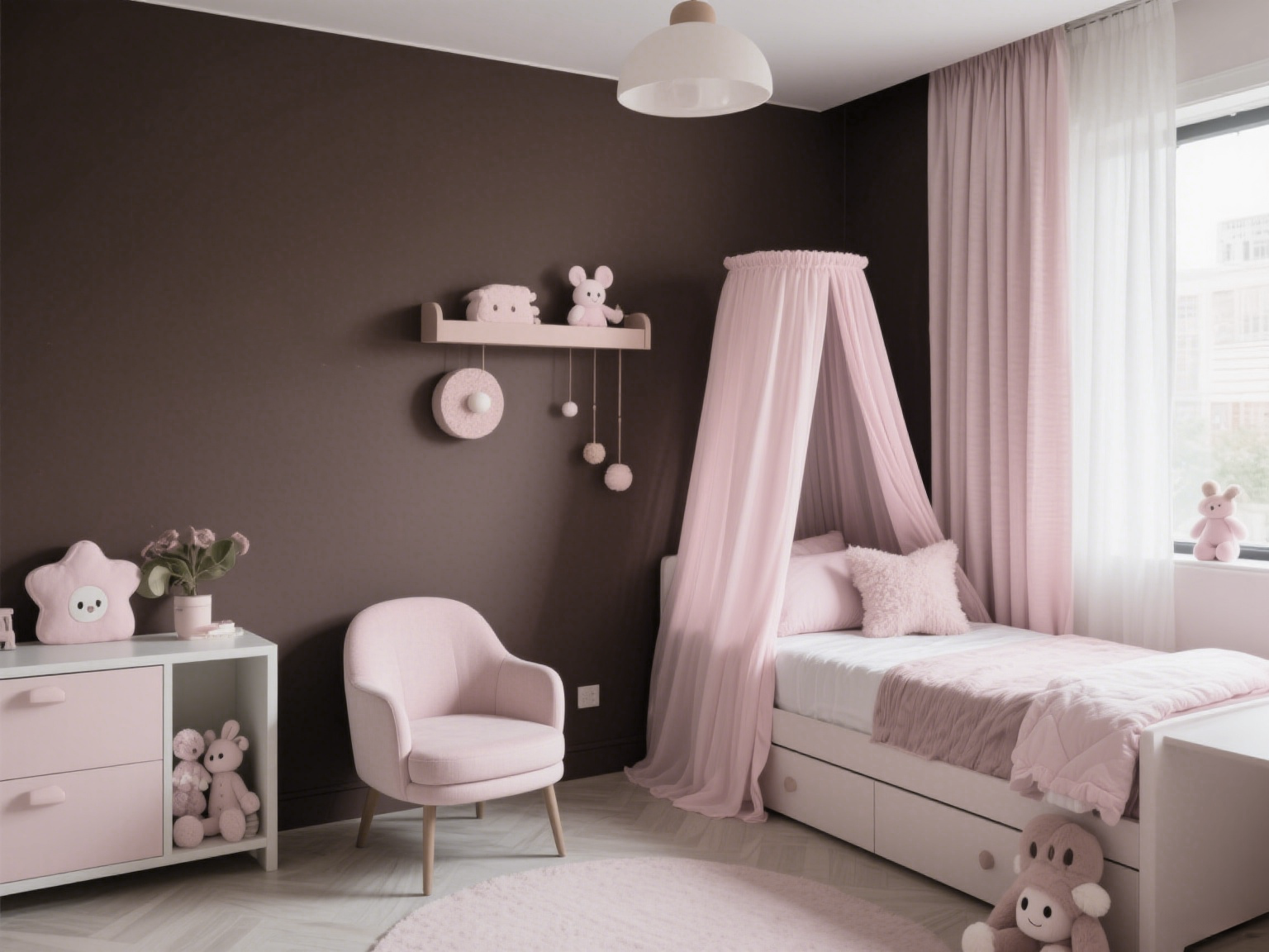
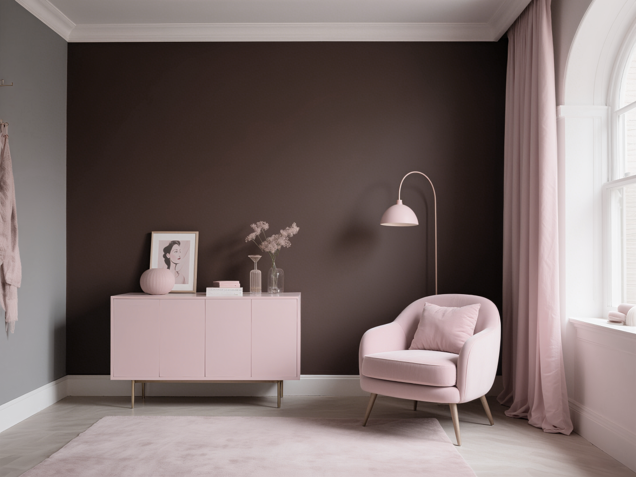
Bold introduction of low saturation powder mix can bring unexpected surprises. The best match for Chocolate Martini is gray powder or clay powder to avoid being too sweet. In children's rooms or women's spaces, this combination satisfies both romantic fantasies and mature temperament. Suggest using a combination of wall color and pink soft furnishings (curtains, single chairs).
04. Vibrant collision art
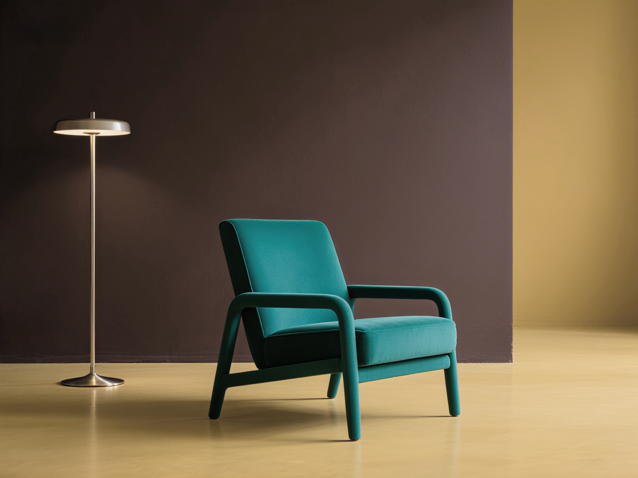
Those who pursue individuality can try colliding with rich turquoise green or mustard yellow. This high contrast scheme requires controlling the proportion - the optimal ratio is 85% main color+10% accent color+5% metallic color transition. In a minimalist space, a turquoise single chair is placed in front of a chocolate colored background, instantly igniting the artistic sense of the space.
Trendy and Classic
The value of color in the era
Classic colors for autumn and winter of 2025/2026
This rich brown tone is not a fleeting trend, but a design language that connects the past and the future. It not only echoes people's collective desire to return to nature and pursue sustainable living, but also aligns with modern urbanites' yearning for exquisite living.
In the current era of more rational consumer behavior, choosing classic color schemes is a wise choice. Compared to the short-lived popularity of bright colors, Chocolate Martini has a longer aesthetic lifecycle. Its inclusiveness enables it to adapt to different styles of soft furnishings, providing residents with sustained color pleasure rather than visual fatigue.
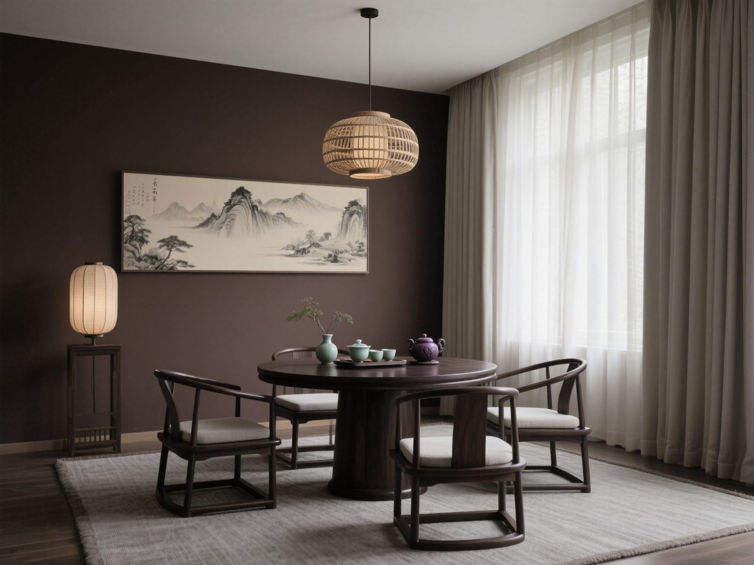
It is worth noting that this color tone exhibits astonishing universality in different cultural backgrounds. The Zen philosophy that echoes the tea ceremony culture in Eastern aesthetics; Reflecting the essence of modern minimalism in Western design; Harmonious coexistence with natural landscapes in tropical regions; In cold regions, it brings visual warmth. This cross-cultural charm makes it a universal language in the global design community.
When the light of dusk passes through the glass window and falls on the chocolate Martini colored wall, the color magically changes - a dark brown background with a faint red copper luster, like the light and shadow of aged wine swirling in a glass. This is its magical moment: interpreting the flow of time on a still wall.
Whether paired with vintage brass wall lamps or set off abstract black and white paintings, this rich color elegantly retreats behind the scenes, making the story in the space the protagonist. It is not just a seasonal trend, but will become a classic footnote that cannot be ignored in the design history of the next decade.
FILOVIA (Asia-Pacific Operation Headquarters-Shanghai, China)
Tel: +86-400-961-6660
Chinese Official Website: https://www.filoviatl.com
International Official Website: https://www.filoviapa.com
Corporate Email: filoviatl@163.com
YAWEIDE (SHANGHAI) COATINGS CO., LTD

FILOVIA Germany
Only produces high-end and high-quality coatings
 FILOVIA
Previous article:Cumulus Cloud: A G . . . . . .
Next article:New Definition of . . . . . .


 German brand
German brand
Asia Pacific Operations Center - Shanghai, China
Southeast Asia Operations Center - Singapore
YAWEIDE (SHANGHAI) COATINGS CO., LTD
 (+86) 400-961-6660
 filoviatl@163.com